About This Component
The design system allows for a variety of hero component configurations. These configurations allow images at varying widths across the page with optional text content and CTAs. Other configurations allow content editors to include videos or text-only approaches with customizable background colors.
Primary Configurations
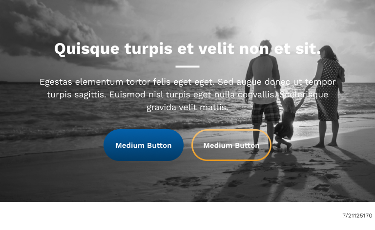
| Extra Large Breakpoint (Desktop) |
|---|
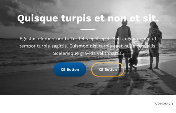
| Medium Breakpoint (Tablet) | Extra Small Breakpoint (Mobile) |
|---|---|
| Key |
|---|
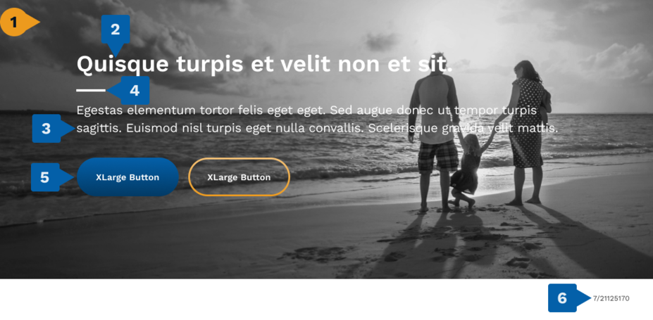
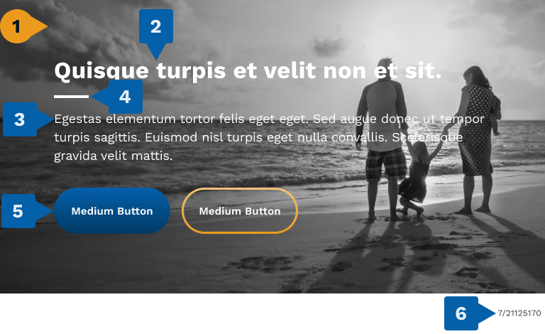
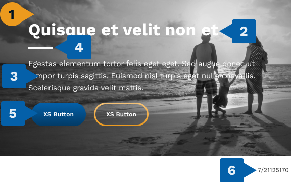
1. Background Image
The background image scales dynamically, expanding to the full width of the page and scaling in height to contain the content overtop it. When considering the height of the image, ensure it has enough space to contain all content (text and buttons) and their respective padding at the top and bottom.
If an image is too large for the content, the site will attempt to scale it down, but the edges of the image may be cut off to fit the content cleanly. Likewise, if an image is too small, it will scale up to fit the page and content but may experience visual degradation because of this.
The site will always maintain the image’s aspect ratio, so there will be no stretching or squishing.
Outlined here are the minimums and maximums for the image to ensure a clean visual appearance. For heroes, it is recommended to provide a unique image for each breakpoint to ensure quality.
- Required: Must be included
- Dimensions:
- Extra Large Breakpoint
- Width: 1200px - 2560px
- Height: 200px - 1097px
- Large Breakpoint
- Width: 1200px
- Height: 200px - 675px
- Medium Breakpoint
- Width: 1000px
- Height: 160px - 576px
- Extra Small Breakpoint
- Width: 576px
- Height: 120px - 576px
- Extra Large Breakpoint
The image for this component otherwise follows the standard requirements outlined in the Images page of this documentation. Please refer to that page for full details on its configurations and options.
2. Title Text
- Optional: Can be excluded, component collapses to hide unused space
- Type Style: Title 1
- Color: NEUTRAL_0 (White), changeable within site color palette
- SEO HTML Tag: H1, changeable within H1 to H6
3. Body Text
- Optional: Can be excluded, component collapses to hide unused space
- Type Style: Paragraph 1
- Color: NEUTRAL_0 (White), changeable within site color palette
4. Under-Title Decoration Line
This line provides a break between the primary title text and other body text. It can be optionally removed, however if either the title or the body is not included then the line should also not be included.
- Optional: Can be excluded, component collapses to hide unused space
- Color: NEUTRAL_0 (White), changeable within site color palette
5. CTA Buttons
- Optional: Can be excluded, component collapses to hide unused space
- Number of Buttons: 0-2, if there is only 1 button it will always be the left-most button
The CTA Buttons for this component follows the standard requirements outlined in the CTA Buttons page of this documentation. Please refer to that page for full details on its configurations and options.
6. FUSE Code
- Optional: Can be excluded, component collapses to hide unused space
The FUSE code for this component follows the standard requirements outlined in the FUSE Code page of this documentation. Please refer to that page for full details on its configurations and options.
Additional Configurations
Content Alignment
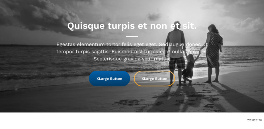
Content within the hero by default is all left aligned, but can be set to all be center aligned.
- Content Alignment: Default left, can be center
Below is an example of the hero when set to center aligned.
| Extra Large Breakpoint (Desktop) |
|---|
| Medium Breakpoint (Tablet) | Extra Small Breakpoint (Mobile) |
|---|---|
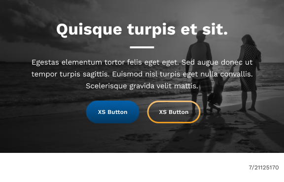
Mobile Semi-Transparent Overlay
Provides an additional layer of semi-transparent dark color over the image but under the text, which can enhance contrast and readability on mobile devices.
- Optional: Default enabled, can be disabled
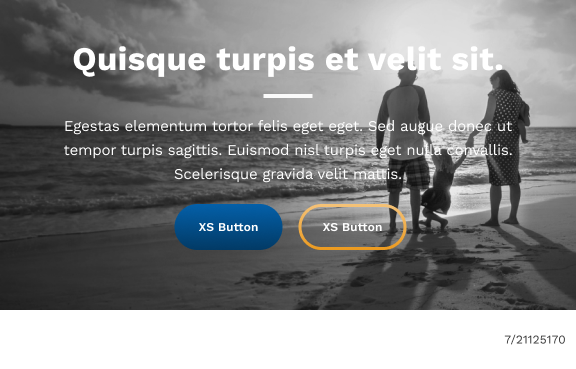
Below is an example of the hero with and without the overlay.
| With Overlay (Default) | Without Overlay |
|---|---|
Resources
CMS Instructions
CMS instructions detailing the steps for configuring this component within the CMS environment are available here.

